Groc


Role
Timeline
UX/UI Designer
UX Researcher
Launch phase:
Aug 2022 --- Jan 2023
Active iteration and updates:
Jan 2023 --- Jan 2024
Team
Product Manager
Front-end Developer
Software Engineer
Market Analyst
Brief
Groc, a new B2B2C/SaaS startup, focuses on delivering better self-checkout solutions.
I've been tasked with revamping Groc's mobile app UX, focusing on creating a seamless end-to-end shopping journey to improve user acquisition
Problem
Groc's market research has revealed following problems:
-
Previous app reflected low conversion rate
-
Low user acquisition and engagement
Goals
-
Lead UX research and design sessions to identify and cater to our target user group, forging a distinctive UX identity that resonates with users' needs and brand character
-
Revamp the app's UI comprehensively to enhance the shopping journey for users while aligning with the business objectives
-
Enhance accessibility and user-friendliness for newcomers by refining the user flow

Impact of my design leadership
-
Launched within 6 month
-
Top 30 most promising SaaS B2B2C product at Global 2023
-
96% positive feedback rate in beta-testings
Design Process

The story starts with...
5 grocery store visits could potentially waste around 40 minutes
Our founder's visit to the downtown grocery store: a bottle of water, a 20-minute wait in line. To put this in context, it's like watching the entire 10-hour Lord of the Rings Trilogy each year!
The story leads to...
How to Minimize Wait Times at the Grocery Store:
A Win-Win Guide for Both Customers and Store Owners
Challenge
-
Groc's 0 understanding towards users
-
Rather new and experimental product concept for the market
-
Tight timeline
Tackling UX Constraints
👨💻
The small size of the software development team would restrict complex design iteration
Ample communication and utilize lean ux development methods
💵
A budget constraint that limits our access to design resources and cuts back the scope of research and testing
Focus on minimal viable product (MVP)
🗃️
No previous UI style guide or design system to standardize communication within the team
Establish a design system and maintain regular team briefings
—01 Discover
Discovery research - what does the user want?

5+
Observation
Individuals aged 18 and above, tech-savvy individuals

10+
Data source
Open for innovation but rooted in pragmatism

4
Interviews
"In-store shopping is time consuming and inconvenience"

The user wants...
an in-person shopping experience that seamlessly combines security,
efficiency to save them time and offer a refreshing approach to retail
Customers, 8:20AM

The stakeholder wants...
I'm hoping for a product that is simple, functional, and aesthetically pleasing. Something feasible to develop and not overly complicated
Product Owner, 13:46PM
—02 Define opportunity
After interviewing 6 participants from our target user segment through convenience sampling, I've pinpointed the fundamental problems in the current design
Users commented: “This app looks so sketchy to me..."
😫
.png)
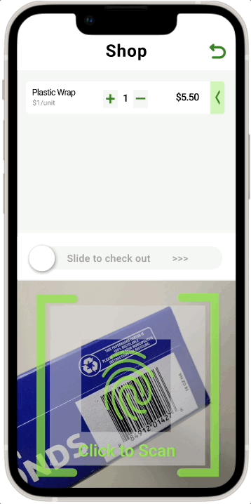
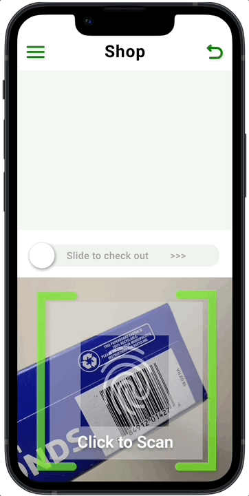
Scan & shop page
Low user engagement value
Little information hierarchy
Friction for further interaction
Pain points with our app
Scan and shop functions are difficult to use, the design lacks accessibility and consistency
Observations showed that users mostly struggled with the scan and shop feature as the pages were overly cluttered, which makes editing items difficult.
—03 Develop
Ideating solutions: ongoing wireframing with users and team in mind
Building on past research and updated design elements, my sketches and wireframes are key for collaborative design iteration discussions with product managers and developers.


Ideation 1
Scan-focused design
Advantage
Low cognitive loads
Streamline scan feature
Trade-off
Review process friction
Lack selling point
Additional developer burden


Ideation 2
Item-review focused design
Advantage
Easy item review
Feasible to develop
Trade off
Excessive tapping points
Cognitive loads


Ideation 3
Simplified item-review design
Advantage
Easy item review
Feasible to develop
Reduce cognitive loads
Fewer tap points
Minor trade off
(future iteration direction)
Unconventional design pattern
Unifying Groc's design language: building design system from 0
I created Groc's design system based on their brand mission and character, which focus on ease and reliability. Through extensive research and competitor analysis, a design system with clean aesthetics was developed to ensure consistency across platforms and support future scalability

Revised Scan & Shop
Minimalist Aesthetic Reflecting Brand Identity
Optimized Display and Organization of Product
Design Iteration - other key screens
Before

After
Simplify modular units, creates breathing space and highlight log-in action
Highlight logo and unified theme color for brand recognition

Before
After
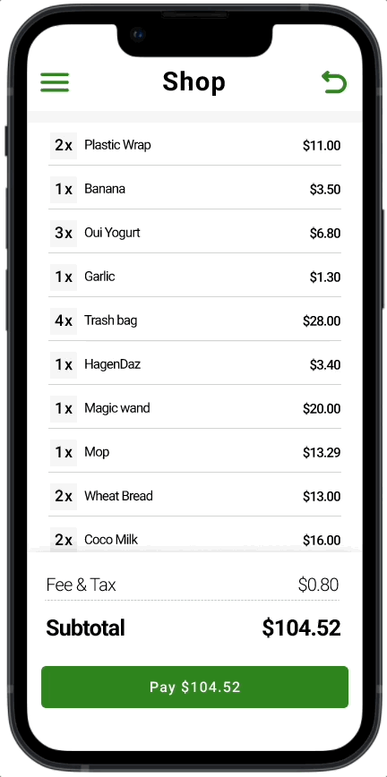
Implemented a baseline grid layout to enhance the discoverability of each item
Verify that color application, typeface choice, and font size comply with WCAG standards
Design Iteration - user flow

Now that we have our design let's launch it in the app store!!
Wait a minute...let's run some research to find out if the iterated design improves user flow and targets users' primary needs
Validating design decision with research, circling back to users
4 different grocery stores with 30 customers ages between 17-48
Following our initial design iteration, I suggested implementing a mixed-method research approach, combining both usability testing and questionnaire, to rigorously evaluate our product in a real-world setting prior to its initial launch


7.7%
Around 92% of customers rated 4 out of 4 on their overall experience navigating through each screen
Our first iteration demonstrates a good understanding of users’ journey, and the labeling and presentation of our information are on the right track.
92.3%
61.9% of customers express their willingness to purchase our service
Our service successfully target one potential pain point of in-store shoppers, and we are confident that our service will fill in a current market gap
.png)
_edited.png)
Yet there're around 46.2% of participants claimed they're confused about the scanning function
Our most important feature—barcode scanning, still has some remaining usability issue for customers and need further iteration
What's the matter with scanning?
Through usability testing, I noticed that customers overlooked the "click to scan" when interacting with the scan feature.
"I thought the camera would just scan the bar code by its own🤔🤔!"
Adds in animation for Visual Aids
To make quick iterations without extra technical and time expenses, I proposed designing a quick animation on the scanning page as mini instruction.
Insights to Action: Decision-making with Cross-functional Team


Elaine 13:00PM
Yeah...but from a developer's perspective, integrating animation could introduce compatibility and maintainability challenges for us. This might require additional time and effort at this stage
Software engineer 13:44PM
Loved your idea, Elaine! Is there any way we can address this differently?
Product manager 14:20PM
.png)
The development team need..
a development-friendly solution that enhances the onboarding experience for first-time users
Dev team 17:30PM
—04 Deliver
Ideation
Quick sketch
Rapid prototyping
Explored options including guided tours with tooltips and interactive tutorials
Created quick sketches of various ideas and sought feedback from the product manager and other team members
Develop an interactive tutorial prototype to ease new user onboarding, without overloading the dev team
Onboarding Guide

CLICKABLE
CLICKABLE
PROTOTYPE
PROTOTYPE
<Click around to interact with the app>
A brief look-back
It has been an inspiring opportunity to collaborate closely with our product manager and software engineer to create an app from scratch. Throughout our launching phase, I embraced the importance of research and observation, allowing me to adapt and refine my designs. Effective team communication consistently encouraged me to view challenges from both user and company perspectives, facilitating necessary adjustments.
Next Steps and Challenges
-
Balancing business owner's profit and customer's self-checkout experience
After our initial launch, we engaged with our primary stakeholders: store owners and managers. They highlighted concerns about the increasing incidents of shoplifting in the market, which has set the stage for my next iteration and testing phase. Continuous improvement is at the heart of my UX design process, and as a team, we deeply value the perspectives of our stakeholders. Stay tuned for more updates!
.png)
Other works...

Donit

DreamLux
.png)