
Role
UX/UI Designer
UX Researcher
Timeline
Aug 2022 --- Jan 2023 (Launch)
Jan 2023 --- Jan 2024 (Iteration)
Skills
Wireframing & Prototype
Market Analysis
UX Research
Stakeholder
Product Manager
Front-end Developer
Software Engineer
Market Analyst

PROJECT CONTEXT
Groc, revamp in-Store Checkout Experience: streamline shopping journey for customers
The Groc mobile app is dedicated to transforming the self-checkout experience, driving efficiency, and increasing sales for in-store businesses. The primary goal is to revamp the product design, creating a seamless end-to-end shopping journey that enhances user acquisition and conversion rates

WORK IMPACT
In 6 month
Design being delivered and launched in app store
Rated top 30
Most promising SaaS B2B2C product at Global 2023
Gain 96%
Positive feedback rate in beta-testings


DISCOVERY
Before I joined Groc, the team lacked data on users. I led rapid discovery research and meet with stakeholders to identify our target audience and define the product's core needs
10+
data source
5
interviews
5+
observation

Amelia, 25
Tech-savvy, open for innovation but rooted in pragmatism
USERS WANT
"Would love a in-person shopping experience that combines security, efficiency to save time and offer a refreshing approach to retail"

Steve, 38
Product manager, aims for cost-effectiveness & quick delivery
STAKEHOLDER WANT
"I'm hoping for a product that is simple, functional, and aesthetically pleasing. Something feasible to develop and not overly complicated"
THE PROBLEM
The Groc App saw high abandonment on the key 'Scan and Shop' page. I interviewed 6 target customers, who noted usability issues and questioned the feature's reliability
😫
"The scan and shop function is so difficult to use and looks sketchy... Is it reliable?"
🤔
Why is the current design not working? Why would it look sketchy? Umm... I need to run a quick design audit to find out
Customers
Me
_edited.png)
Shop N Scan 1.0
lack of efficiency and consistency
IDEATING LOFI SOLUTION
When ideating design solutions, I focus on simplifying interactions and visual aids and reorganizing element hierarchy to improve efficiency and boost task completion rates.

Solution 1
Scan-focused design
Advantage
Trade-off

Solution 2
Item-review focused design
Advantage
Trade-off

Solution 3
Simplified item-review design
Advantage
Minor trade off (future iteration)
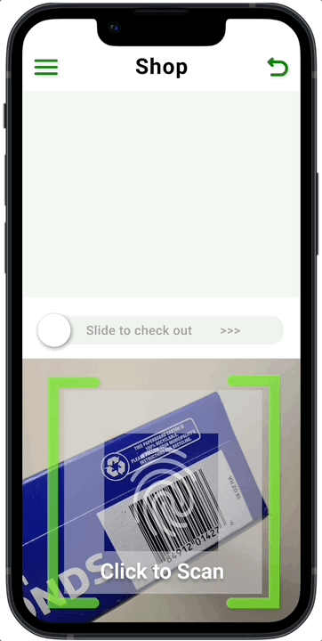
HIFI MOCKUP
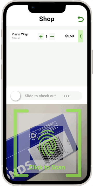
Shop N Scan 2.0
Improved structure and interaction
OTHER KEY ITERATION

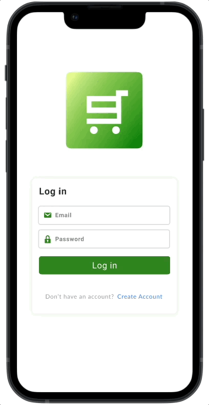
Registration 2.0
Emphasize call to action and navigation

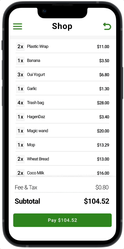
Check out 2.0
Streamline informational value and check out efficiency
ITERATED USER FLOW

Product manager, 12:44PM
Now that we have our design let's launch it in the app store!!
Me, 1:12 PM
Wait a minute...let's run some research to find out if the iterated design improves user flow and targets users' primary needs
USABILITY TESTING - DESIGN VALIDATION
4 grocery stores visits with 30 customers ages between 17-48
I implemented a mixed-method research approach, combining both usability testing and a questionnaire, to evaluate our product in a real-world setting before its initial launch


7.7%
92% of customers rate 5/5 for page navigation
The design demonstrates a good understanding of users’ journey, and the labeling and presentation of our information are on the right track.
92.3%
61.9% of customers express their willingness to purchase our service
Our service successfully target one potential pain point of in-store shoppers, and we are confident that our service will fill in a current market gap.
.png)
_edited.png)
But around 46.2% of participants have difficulties activating scanning
The most important feature—barcode scanning, still has some remaining usability issue for customers and need further iteration
What's up with scanning? Finding root cause
"The instruction wasn't clear... I thought the camera would just scan the bar code by its own🤔🤔!"
Customer A, 3:12 PM
"Umm, the dev team doesn't have much time to implement over-complex onboarding feature"
Developers, 4:22 PM
NEXT STEP - BALANCING CONSTRAINTS WITH OPPORTUNITY

BRIEF LOOK BACK
My key takeaways
-
There's never a perfect scenario—constraints will always arise when designing. The key is to be adaptable and find creative ways to work around them.
-
Support proposals with solid evidence and data—numbers speak louder and foster clear, effective communication across teams

Other works...

Donit

MongoDB
.png)