
Timeline
Dec 13,2022 -- Dec 17, 2022
Tools
Figma, Paper Sketch
Role
UX Sprint Design

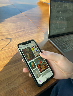
Sprint Design: Gallery Pal
Improve the experience of viewing art in a museum or gallery
Context
Most museum visitors have difficulty absorbing sufficient information about the exhibits before their visits, which could interfere with their understanding of artworks and harm their overall visiting experience. I wanted to design an app that offers in-time and easy exposition for audiences of all ages. By incorporating agile methodology and lean UX, I set out to design within a time-boxed period to familiarize myself with most companies' design cycles.
Day 1 - Map


Day 1
Based on the users' interviews and user persona, I generated findings that help to understand the problems and build an outline for end-to-end user experience
Overall, visitors are highly interested in the background information about the art piece before they visit these art pieces. They think they would gain more from the visit experience if they could learn more about the work they’re seeing. However, the problem was that the information online was too in-depth and overwhelming to read, and they found it challenging to consume all the information at once.
Day 2 - Sketch


Day 2
Then I created different sketches for my app's key feature --- scanning and art information, with inspiration from past museum apps.
While going through the lightning demo stage, I gained lots of insights into what current museum apps look like on the market and how they embody certain key features. I want to address the in-time and accessible commentary function as the app's key function. The lightning demo provided me a chance to look through different layouts and structures of each function screen as well as some ideas on the sitemap.
In addition, quick research on other apps helps me get an overall picture of the standard of each UI component(size of the font, the proportion of the painting, etc.)
Day 3 - Decide

Day 3
With all the different ideas generated in the sketch phase, I chose to combine some ideas and build a user storyboard for an most viable product.
When I’m creating the storyboard, it reminds me of both the user flow and site map creation processes. Through this step, I get to focus on the key feature I want to stress about my design and re-think the user flow so that I can make the flow smoother. Since it’s a sprint design, I don’t have much time to linger on my design aesthetic but primarily consider functionality and usability.
Day 4 - Prototype

Day 4
Then I go on to create a Hi-Fi prototype that resembles bare essentials based on the storyboard I created
Since it is a sprint design, I tend to focus on the red routes and the most viable functions of the mobile app — Scan and art information. For the prototyping and usability testing process, I want to determine if the labeling and connection between each screen make sense to the users and if they can successfully locate the designated destination.
Day 5 - Test

Day 5
Finally, I wrap up my sprint design journey with 5 rounds of usability testing, aiming to find out the discoverability issue within my design
Before the usability testing: How is the discoverability of the key function? Is there any presentation error that would influence the user flow?
During the usability testing: Through 5 rounds of interviews, I found out that my users understood the labeling well and could navigate through key screens. However, there is some confusion regarding some icons—they were having difficulty recognizing the “zoom in” button, which resembles characters of the “search” function. Also, they can hardly recognize the “play video” button.
After the usability testing: I changed and added labeling to icons and refined visual aids that I applied to my design which provides clearer guidance to my users.
Final Product
Reflection
Through this sprint design project, I learned to approach end-to-end design processes in an agile development mode, which prompted me to come up with multiple solutions in a short timeline and concentrate on the product’s most important features with restriction.
If I have more time, I would first like to lead more interviews to find any other pain points lying under the museum touring experience and current museum app. I would also conduct a few more rounds of contextual usability testing and investigate how my participants interact with my app in a real-life context.
Other works...
Groc

PieBird
